


The Lit. Nanny
Branding The Lit. Nanny needed to be done skillfully. The image needed to be slightly modern, yet traditional to project that while the fundamentals of literacy are unchanging, the approach must always be tailored for each generation.
Read on below ⇣

The site redesign also needed to skillfully transition from a single, scrolling page to a full, meaningful website-
cleanly organized into sections and information areas that would inspire new families to click and learn more about their services.
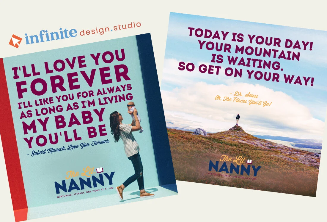
We used a slab script to accentuate a forward-thinking mindset,
a title case sans serif in bold colorways to convey trust, and an open book icon to visually explain the abbreviation.

A lifestyle photoshoot,
new typeface additions, and a more robust color palette later and we had designed the new site (an elevated the brand image) to showcase a full library of content complete with raving reviews, hero text, bold layouts, and memorable infographics.
Simply put, the final result was magic, just like Gina and her wonderful literacy services!
Branding


The Lit. Nanny, llc. is passionate about nurturing literacy one home at a time! They inspire parents to encourage literacy in the lives of their children through treasured services like parent consultations, student tutoring, helpful resources, and more.